SNOW Architecture.
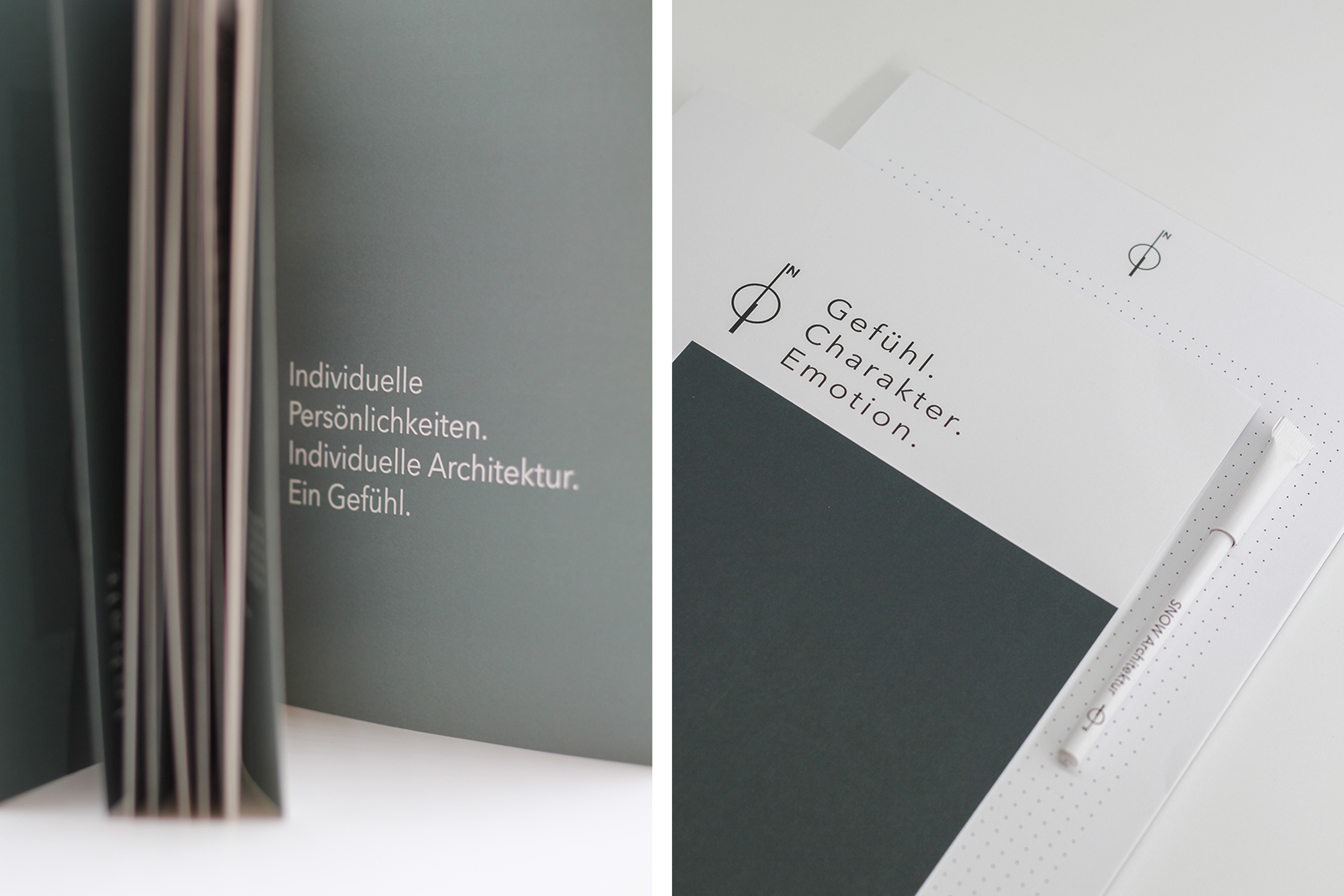
A feeling - that is what SNOW ARCHITEKTUR is intended to convey. In order to give the feeling as much individual space as it needs, we work with simple design that does not impose itself, but rather accompanies and supports the design of the architecture. An important design element here is the white space, which leaves room for reflection and interpretation.
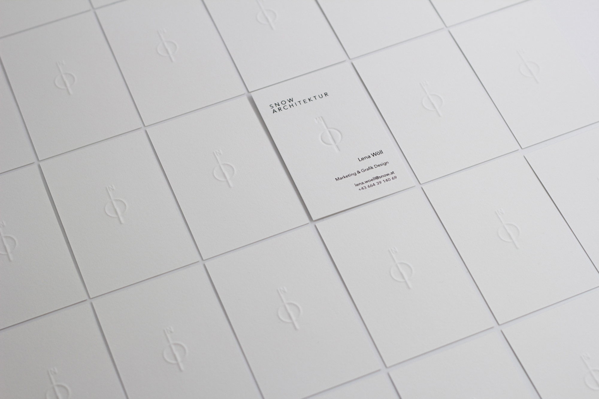
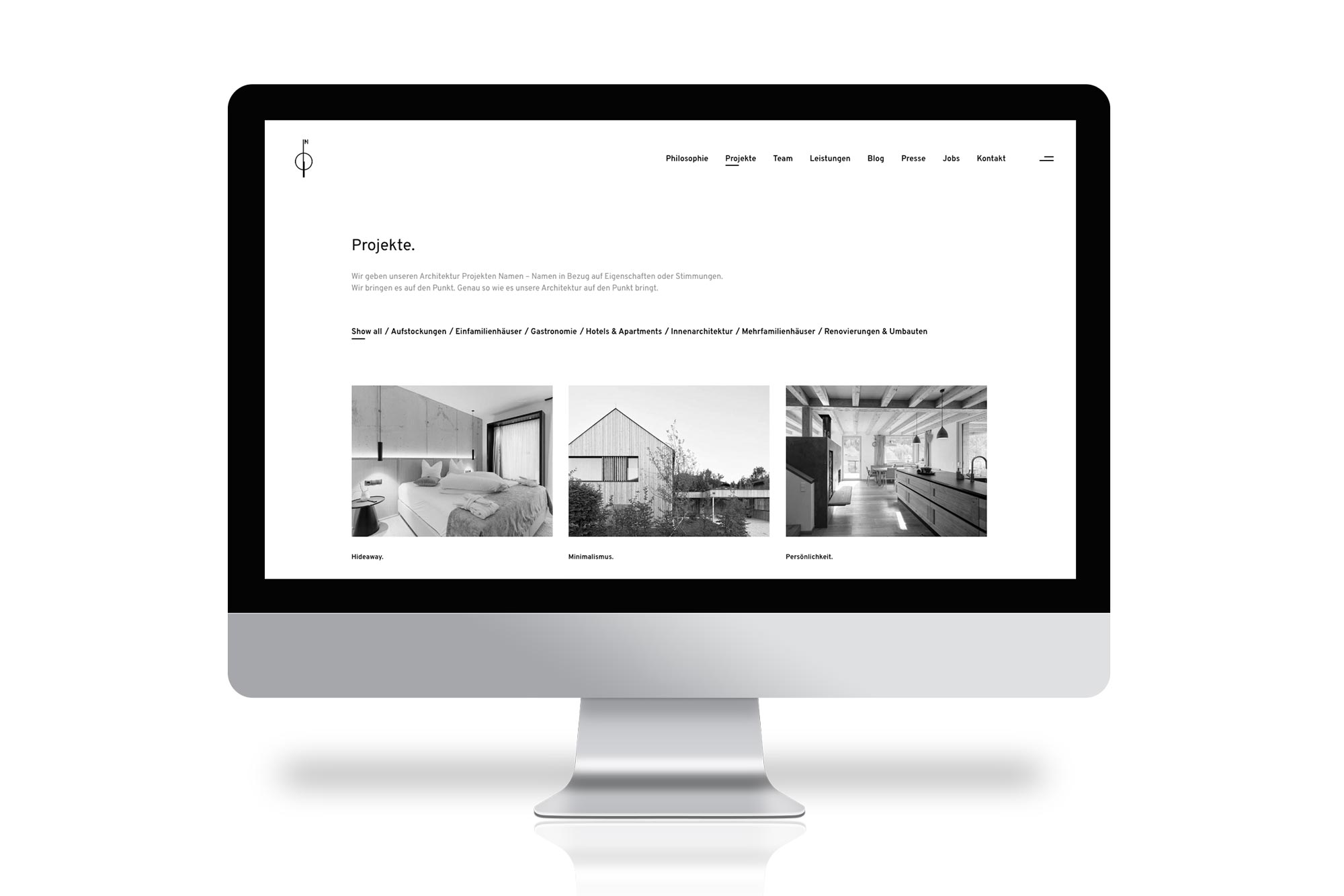
Young, minimalist and timeless are keywords that are immediately associated with the design of SNOW ARCHITEKTUR. This starts with the design of the logo and runs through the entire concept. The logo represents a compass, which is important for our architects as they reduce the object to the cardinal points at the beginning of the creation process. The shape of the logo is also used as a north arrow in floor plans. The compass was taken from the original logo to appear in a simplified form. Otherwise, matt, desaturated colors are used in the design, which bring color to the simple concept in a gradation from petrol to light gray.
Clear communication should not only take place internally with employees and externally with customers. This should be recognizable in the external appearance even before the first contact. This is achieved through the use of white space, which directs the focus to the essentials and simplifies the reading of texts. The dot was defined as an additional design element. This is used, for example, in headings ("Who we are.") or project names ("Minimalism."). The dot creates pauses for creativity and gives individual words more power. Despite its static character, the Avenir Next font exudes a certain liveliness, which is seen as a bridge to architecture. It is sans serif and creates a neutral typeface for the viewer. By using different sizes and weights, it offers optimum harmony and contrast and can be used flexibly. In the printed matter, the large spacing of the headlines draws the eye. What is also important to us in the design of SNOW ARCHITEKTUR's communication is the theme of personality. That's why it's part of the concept to bring the employees and their expertise to the outside world by repeatedly publishing quotes or interviews.
When printing, care is mainly taken to use uncoated paper, which is one of SNOW ARCHITEKTUR's values in terms of sustainability. A special exception in printing is the business card, which is unique due to the embossing of the logo.