Apartment house Lebe'oetz.
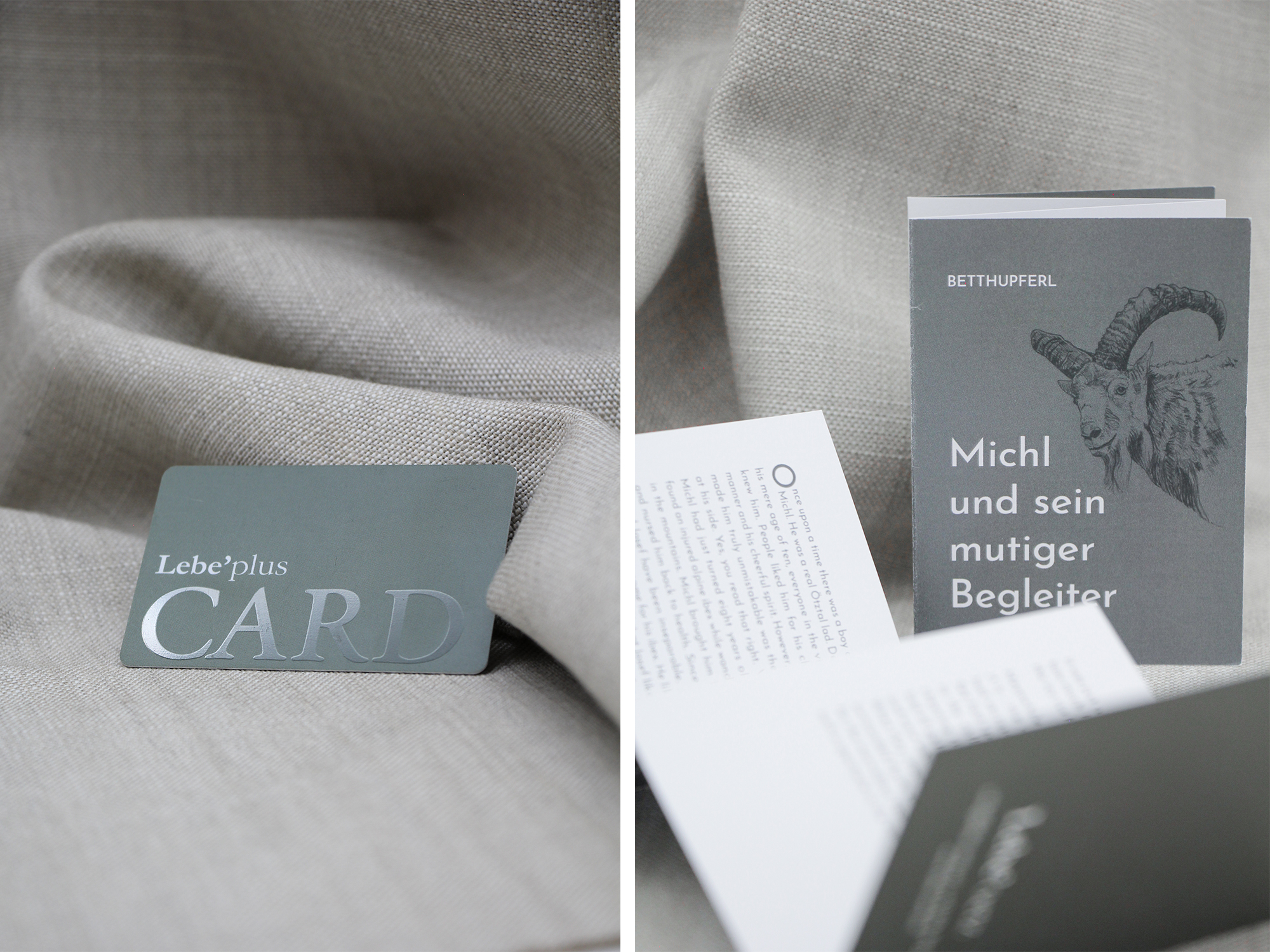
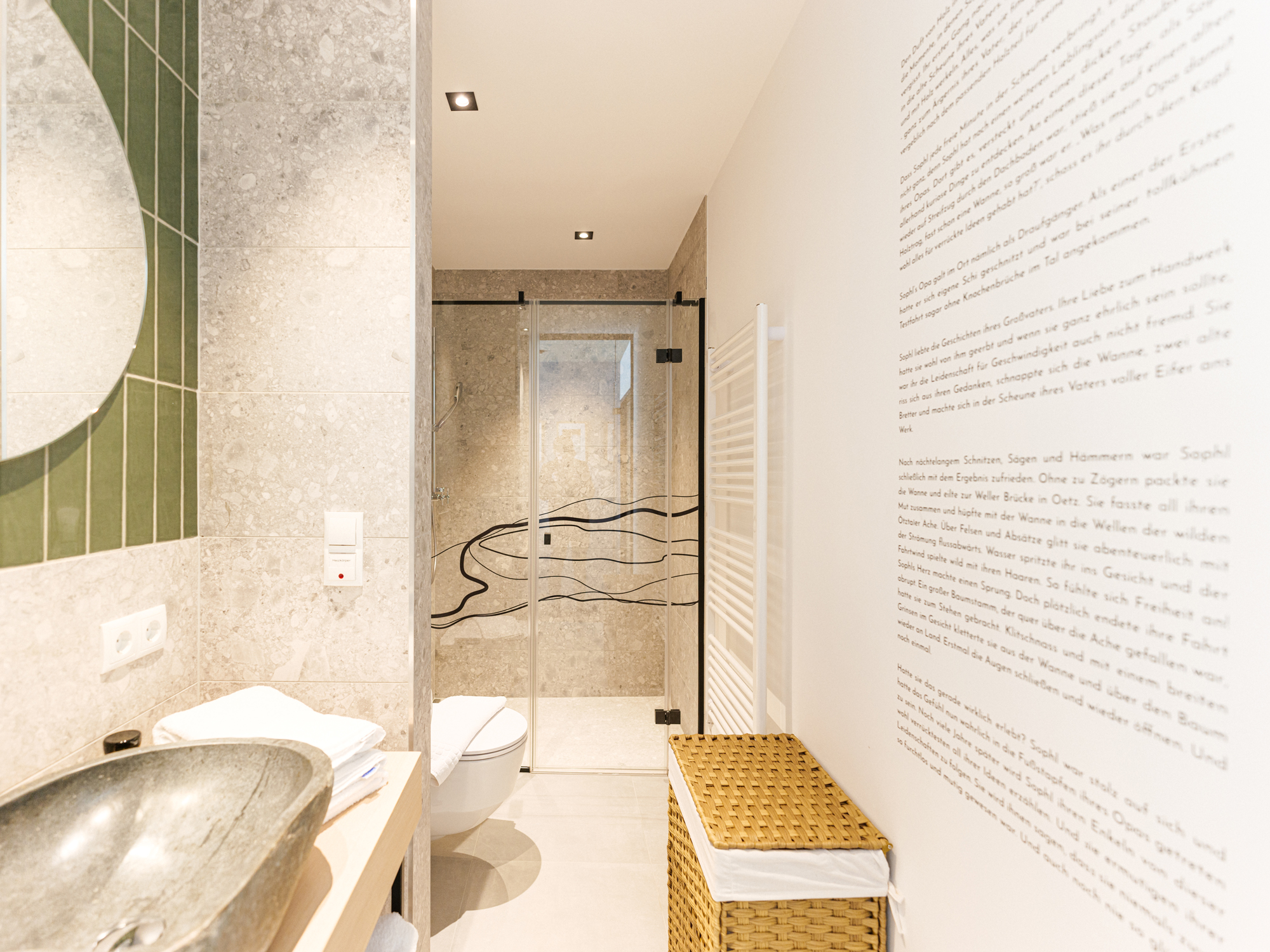
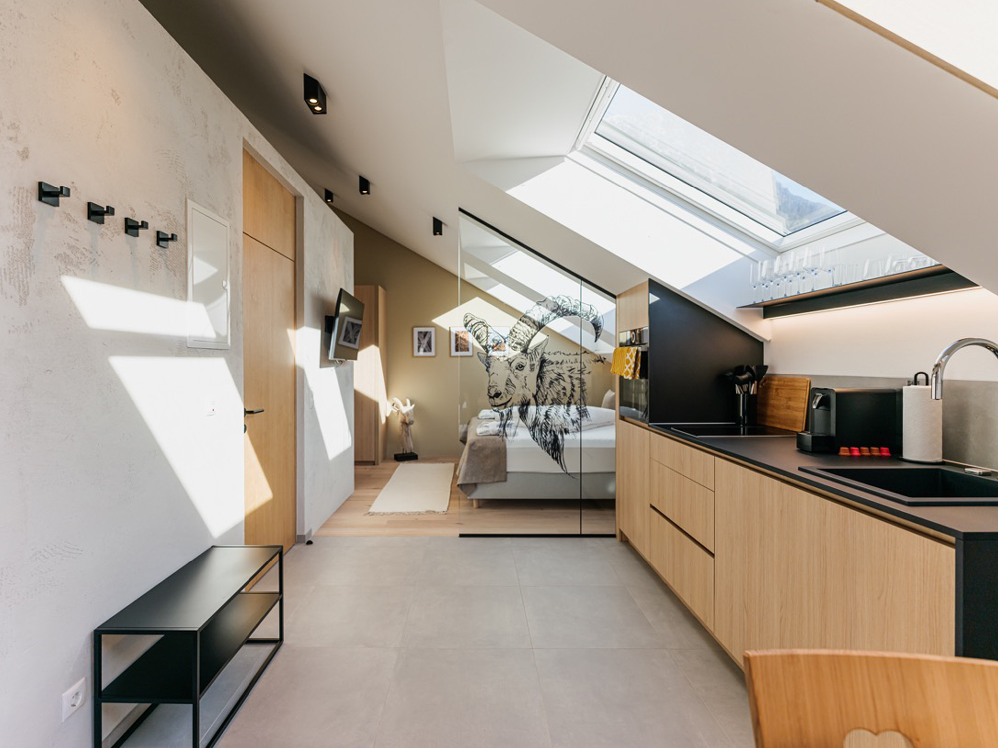
"Storytelling is not something we do. Storytelling is who we are." With this statement in mind, we worked closely with the interior designers to come up with a holistic corporate identity for the new Lebe'oetz apartment building. Construction began with the demolition of an old barn, which gave the new building its place on a site full of old tradition and history. It was important to us that part of the Ötztal history that the old barn told should be preserved in the new house. This gave rise to the idea of using storytelling to fill the house with stories from Ötztal's past and the landscape shaped by the mountains. Each of the five apartments was given a typically rustic, Ötztal name: Zita, Sophl, Frånz, Michl and Traudi. A story was written for each of these characters, which serves as the basis for the customer experience. The stories are conveyed to guests by means of "bedtime stories" for adults and children in the form of folded flyers personalized with drawings of the characters. Parts of the stories and drawings can also be found in the apartments in the form of wall or glass coverings. In addition, recipes were created for cooking, which were also selected and prepared to suit the stories of the characters.
Otherwise, the design of the Lebe'oetz apartment building was kept simple. The font logo in black was specified by the uniform concept of the Lebe'apartments. The font to be used has serifs in contrast to the other fonts and therefore stands out clearly.
Colors were defined in desaturated natural colors such as brown or green, which also fit in with the traditional Ötztal and reflect the character or passions of the characters. In general, the design is clean and characterized by a lot of white space in addition to all the profundity.
A wording concept in which a play on words is created from the variations of the name ensures coherence and consistency in the hotel. Lebe'plus Card, Lebe'bonus, Lebe'hofladele, Lebe'mobil, are examples of how guests are given an even greater sense of experience and how the concept merges even more into a single entity.
The Lebe'plus Card, which is printed with a foil finish, has special printing features.